

March 2026 Jobs Report and Why You Should Care
Every first Friday of the month, financial markets collectively hold their breath. News anchors start using phrases like “nonfarm payrolls” and “labor force participation rate,” and your social media feed fills with hot takes about numbers that seem disconnected from real life. If you’ve ever stared at one of these reports and thought, “I have no idea what any of this means,” you’re not alone – and honestly, nobody explained it well to you. That changes right now.
The Bureau of Labor Statistics (BLS) publishes what’s formally called the employment situation summary each month, and it’s one of the single most important economic reports in the country. Understanding it, even at a basic level, can help you make smarter decisions about your career, your savings, and your financial planning.
Two Surveys, One Report: Here’s the Trick Most People Miss
The jobs report isn’t one survey. It’s two completely separate surveys stitched together, and they measure different things. This trips up almost everyone, including people who should know better.
The Household Survey (CPS)
The Census Bureau calls about 60,000 households each month and asks people directly about their work status. Are you employed? Unemployed? Looking for work? Not looking? This is where the unemployment rate comes from.
The Establishment Survey (CES)
The BLS surveys roughly 119,000 businesses and government agencies covering about 629,000 individual worksites. This tells us how many jobs were added or lost, what industries are hiring, and what people are earning.
Here’s why that matters: the two surveys sometimes tell different stories. The household survey might show unemployment ticking up while the establishment survey shows jobs being added. That’s not a contradiction – it’s two different cameras pointed at the same economy from different angles.
|
Feature |
Household Survey (CPS) |
Establishment Survey (CES) |
|---|---|---|
|
Who gets asked |
~60,000 households |
~119,000 businesses |
|
What it measures |
Employment status of people |
Jobs, hours, and earnings |
|
Key output |
Unemployment rate |
Nonfarm payroll number |
|
Counts self-employed? |
Yes |
No |
|
Counts multiple jobs? |
Once per person |
Each job separately |
» Understand inflation trends and how they impact your finances: March CPI Report
The Unemployment Rate: Not What You Think
Most people assume the unemployment rate counts everyone who doesn’t have a job. It doesn’t. Not even close.
To be counted as “unemployed” by the BLS, you must:
-
Not have worked at all during the survey reference week
-
Have actively looked for work in the past four weeks
-
Be currently available to take a job
If you gave up looking three months ago because nothing panned out, you’re not “unemployed” in the official count. You’re “not in the labor force.” This is a crucial distinction.
In the March 2026 report, the unemployment rate sat at 4.3%, with about 7.2 million people officially counted as unemployed. But here’s the fuller picture: another 6.0 million people wanted a job but weren’t counted because they hadn’t actively searched recently. Among those, roughly 510,000 were classified as “discouraged workers” who had simply stopped looking for work because they believed no jobs were available to them. That number jumped by 144,000 in a single month.
The headline unemployment rate is useful, but it’s like checking only the temperature without considering humidity, wind, or the UV index. You get a number, but you miss the full picture of the weather.
» Streamline your income and get paid without delays: How To Set Up Direct Deposit In Minutes
Reading the Payroll Number Without Panicking
The establishment survey headline for March 2026: the economy added 178,000 nonfarm payroll jobs. Sounds decent, right? But context matters enormously.
February had been revised to show a loss of 133,000 jobs. January was revised up to 160,000. So the three-month picture was choppy, not catastrophic, but not exactly inspiring confidence either.
When you see the monthly payroll number, keep these benchmarks in mind:
-
Under 100,000 jobs added: Generally considered weak. The economy needs roughly 100,000-150,000 new jobs per month just to keep up with population growth.
-
100,000-200,000: Moderate. Enough to tread water and maybe make slow progress.
-
Over 200,000: Strong. The kind of number that makes economists cautiously optimistic.
-
Negative (job losses): A red flag, though one bad month doesn’t make a recession.
These are rough guidelines, not gospel. A financial advisor can help you interpret how specific employment trends might affect your personal situation, whether that’s career planning, investment decisions, or retirement timing.
» Build income and reduce housing costs with a house hacking strategy: Starting A House Hacking Strategy
Where the Jobs Actually Were (and Weren’t)
The sector breakdown is where the BLS employment situation summary gets genuinely interesting. March 2026 painted a pretty specific picture:
Winners:
-
Health care: +76,000 jobs. This was the standout. About 35,000 of those came from physicians’ offices as workers returned from a strike, so the number was somewhat inflated. Still, health care had been averaging 29,000 jobs per month over the prior year, so the underlying trend was solid.
-
Construction: +26,000. A decent month, though the sector had been flat over the prior twelve months overall.
-
Transportation and warehousing: +21,000. Almost all of this came from couriers and messengers (+20,000). But zoom out, and the sector had shed 139,000 jobs since its peak in February 2025.
Losers:
-
Federal government: -18,000. This was part of a sustained decline. Since October 2024, federal employment had dropped by 355,000 positions – an 11.8% reduction. That’s a significant contraction in a sector that typically provides stable employment.
-
Financial activities: -15,000. Finance and insurance specifically lost 16,000 jobs, continuing a downward trend of 77,000 lost positions since a May 2025 peak.
Flat: Mining, manufacturing, wholesale trade, retail trade, information, professional and business services, leisure and hospitality, and other services all showed little meaningful change.
If you’re job hunting or thinking about a career shift, these sector trends are far more useful than the headline number. Health care continues to add jobs, regardless of what the broader economy does. Federal employment, on the other hand, was clearly contracting.
Wages and Hours: The Part That Affects Your Wallet
Average hourly earnings for private-sector workers rose 0.2% in March to $37.38. Over the full year, wages grew 3.5%. Production and nonsupervisory workers (think: non-management roles) earned an average of $32.07 per hour.
Here’s how to think about that 3.5% annual wage growth: if inflation is running that number below, workers are gaining purchasing power. If inflation is running above it, those raises are an illusion – you’re earning more dollars that buy less stuff.
The average workweek also ticked down slightly to 34.2 hours. A declining workweek can signal that employers are reducing hours before resorting to layoffs, so economists watch this as a potential early warning sign.
|
Wage Metric |
March 2026 |
Monthly Change |
Annual Change |
|---|---|---|---|
|
Avg. hourly earnings (all private) |
$37.38 |
+0.2% |
+3.5% |
|
Avg. hourly earnings (production workers) |
$32.07 |
+0.2% |
N/A |
|
Avg. weekly hours (all private) |
34.2 hrs |
-0.1 hr |
N/A |
|
Manufacturing weekly hours |
40.2 hrs |
Unchanged |
N/A |
Why Revisions Matter More Than You’d Expect
Here’s something that catches beginners off guard: the first jobs number released is always preliminary. It gets revised twice over the following two months as more data comes in.
For March 2026, the BLS revised January’s number up by 34,000 (from +126,000 to +160,000) and February’s number down by 41,000 (from -92,000 to -133,000). The net effect: 7,000 fewer jobs than previously reported across those two months.
This is why reacting to a single month’s headline number is usually a mistake. The smart move is to look at three-month averages and wait for revisions before drawing conclusions. Financial markets often overreact to the initial release, creating both risks and opportunities for investors. If you’re making portfolio decisions based on employment data, talking to a financial advisor first is always worth your time.
What the Long-Term Unemployed Number Tells You
One of the most underappreciated data points in the report: long-term unemployment. In March 2026, 1.8 million people had been jobless for 27 weeks or more, up 322,000 from a year earlier. These long-term unemployed made up 25.4% of all unemployed workers.
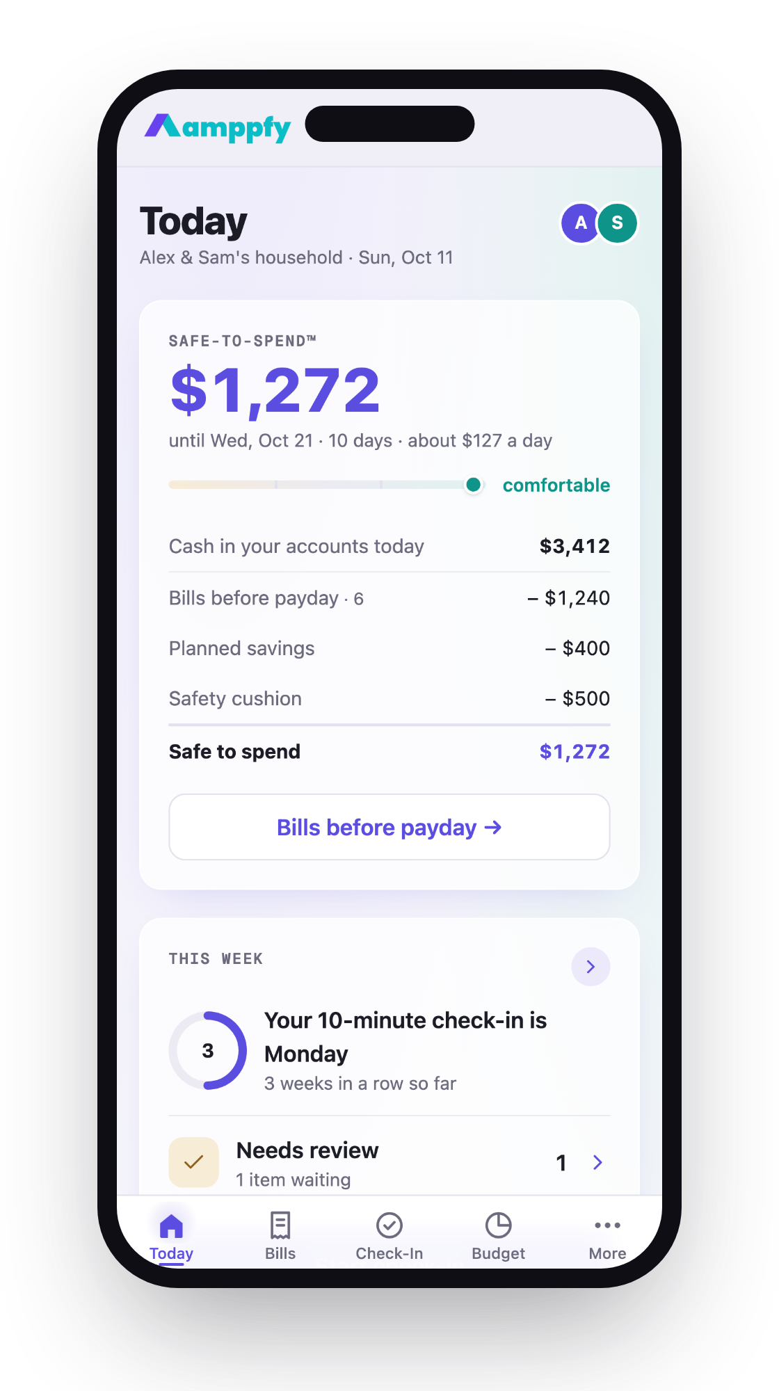
That’s a meaningful increase. Long-term unemployment erodes skills, depletes savings, and creates a vicious cycle where the longer you’re out of work, the harder it becomes to get hired. If you’re building an emergency fund, this stat is a good reminder of why most financial planners suggest covering three to six months of essential expenses. Tools like Ampffy can help you map out exactly how much that means for your specific household and automate the savings process so you’re building that buffer consistently.
Making This Data Work for You
The monthly jobs report isn’t just for economists and traders. If you’re negotiating a raise, the wage growth data tells you what the market is doing. If you’re considering a career change, the sector breakdown shows you where momentum is building. If you’re saving for the future, employment trends can inform how aggressively you build your emergency fund or adjust your investment timeline.
You don’t need to memorize every table. Just knowing the unemployment rate, the payroll number, wage growth, and which sectors are expanding or contracting puts you ahead of most people. And that knowledge compounds over time – each month’s report starts making more sense as you build context from the last one.
Frequently Asked Questions
What exactly does “nonfarm payroll” mean?
It’s the total number of paid workers in the U.S., excluding farm employees, private household employees, nonprofit organization workers, and active-duty military personnel. The BLS excludes these groups because farm employment is highly seasonal, and the other categories are difficult to survey reliably. When news outlets say “the economy added 178,000 jobs,” they’re referring to changes in this nonfarm payroll count from the establishment survey.
How can the economy add jobs while unemployment stays the same?
This happens more often than you’d think. The unemployment rate comes from the household survey, while job gains come from the establishment survey. They use different methodologies and sample different populations. Also, if more people enter the labor force (start looking for work) at the same rate jobs are created, the unemployment rate can hold steady even as payrolls grow. The labor force participation rate in March 2026 was 61.9%, meaning nearly 38% of the civilian population wasn’t in the workforce.
Should I make financial decisions based on a single jobs report?
Generally, no. One month’s data is noisy and subject to revision. Weather events, strikes, seasonal quirks, and survey timing can all distort a single report. Looking at 3 to 6-month trends gives you a much clearer signal. If employment trends are influencing decisions about your career, investments, or major purchases, consider consulting a qualified financial professional who can contextualize the data for your specific situation. Past employment trends don’t guarantee future economic conditions.
Where can I find the full employment situation summary report?
The BLS publishes the complete report at bls.gov/news.release/empsit.nr0.htm on the first Friday of each month at 8:30 a.m. Eastern Time. The site includes dozens of detailed tables breaking down employment by demographics, industry, duration, and more. The next release after March 2026 was scheduled for May 8, 2026. You can also sign up for email alerts from the BLS so you never miss a release.
It’s the total number of paid workers in the U.S., excluding farm employees, private household employees, nonprofit organization workers, and active-duty military personnel. The BLS excludes these groups because farm employment is highly seasonal, and the other categories are difficult to survey reliably. When news outlets say “the economy added 178,000 jobs,” they’re referring to changes in this nonfarm payroll count from the establishment survey.
This happens more often than you’d think. The unemployment rate comes from the household survey, while job gains come from the establishment survey. They use different methodologies and sample different populations. Also, if more people enter the labor force (start looking for work) at the same rate jobs are created, the unemployment rate can hold steady even as payrolls grow. The labor force participation rate in March 2026 was 61.9%, meaning nearly 38% of the civilian population wasn’t in the workforce.
Generally, no. One month’s data is noisy and subject to revision. Weather events, strikes, seasonal quirks, and survey timing can all distort a single report. Looking at 3 to 6-month trends gives you a much clearer signal. If employment trends are influencing decisions about your career, investments, or major purchases, consider consulting a qualified financial professional who can contextualize the data for your specific situation. Past employment trends don’t guarantee future economic conditions.
The BLS publishes the complete report at bls.gov/news.release/empsit.nr0.htm on the first Friday of each month at 8:30 a.m. Eastern Time. The site includes dozens of detailed tables breaking down employment by demographics, industry, duration, and more. The next release after March 2026 was scheduled for May 8, 2026. You can also sign up for email alerts from the BLS so you never miss a release.