Share via:

-
Save
On May 12th, 2016, Google rolled out a critical ranking signal requiring websites to be mobile-friendly. Today, passing the mobile-friendliness test is an essential SEO strategy for mobile search rankings.
Latest Mobile SEO Search User Data
- In 2021, there were 7.1 billion mobile users worldwide, and 85% of Americans own a smartphone. (Statista)
- By the end of 2021, mobile devices drove 54.4% of global website traffic. (Statista)
- 46% of Americans spend five to six hours on their phones daily, and another 22% spend three to four hours on the phone every day. (Statista)
What is a Mobile SEO Friendly Website?
A mobile-friendly website is based on a responsive web design that intuitively adjusts the webpage layout to fit the viewing device. In other words, the mobile version of a website should not look like a shrunken-down version of the desktop view with illegible fonts or broken navigation. The mobile-friendliness ranking signal impacts the overall SEO marketing strategy and mobile search ranking.
What is Mobile SEO?
Mobile SEO defines how a website should serve content when searches are done through mobile devices. For the best user experience, website content should be synchronized and responsive on all viewing devices, including desktop, tablet, and mobile views.
An intuitive and responsive web design allows all the elements on a website to dynamically adjust according to the visitor’s screen size. More importantly, it enables all SEO work completed for the desktop version of the website to apply seamlessly to the mobile version.
What if Your Website is Not Mobile SEO Friendly?
Google penalizes unqualified websites that are not mobile-friendly by excluding webpages from mobile search queries. To be mobile-friendly, the top priority is to update the website structure.
Mobile SEO Friendliness is a Critical Search Engine Optimization Ranking Signal
As of August 31, 2016, Google officially removed its “mobile-friendly” label from mobile search results. If a website does not comply with the requirements, its webpages will not appear in mobile search results. Mobile-friendliness becomes a required ranking signal as smartphone users continue to increase. So, make sure your website has a responsive design that intuitively works with all screen sizes.
Mobile SEO Strategy Explained by Google
Here is a Q&A video from Google Search Central explaining the latest mobile-friendly ranking changes.
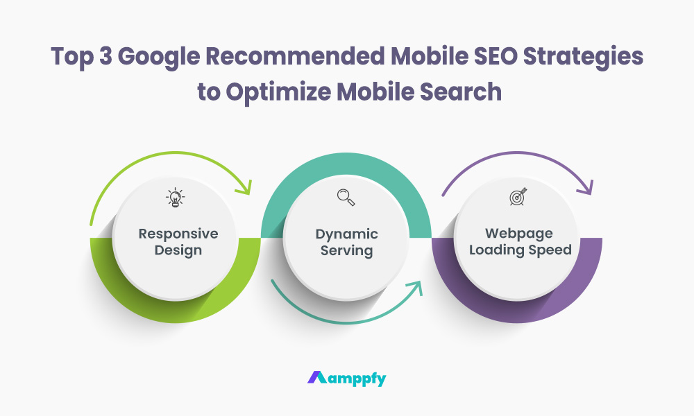
Top 3 Google Recommended Mobile SEO Strategies to Optimize Mobile Search
-
Save
Being mobile-friendly ensures all versions of a website are fully search engine optimized. Here are the top Google-recommended mobile SEO strategies to optimize a website for search.
#1. Responsive Design to Optimize Mobile SEO
Responsive design serves the same HTML code for desktop and mobile. This design automatically adapts to different viewing devices. The same URL is used for a webpage on desktop, tablet, and mobile views. Responsive design is a widely adopted method that utilizes CSS (Cascading Style Sheets – a web design language) to structure a desktop website to flow intuitively into the mobile version. When coded correctly, content on a desktop website automatically displays and functions appropriately in mobile view.
#2. Dynamic Serving to Optimize Mobile SEO
Dynamic serving is also known as adaptive web design. Dynamic serving displays a different set of HTML code on desktop versus mobile devices. However, the URL of a webpage stays the same regardless of the viewing device.
Similar to responsive web design, dynamic serving pulls the entire content from the desktop website. The difference is that dynamic serving can distinguish whether a user is on a computer, tablet, or mobile device. Then, it intuitively determines which copy of HTML code should be served to display the website.
#3. Optimize Website Page Loading Speed to Improve Mobile SEO Search
Loading speed of a website on mobile is important. Visitors are impatient when waiting for a website to load, especially on a mobile device. A slow-loading website can result in a high bounce rate (someone leaving a webpage without taking action), negatively impacting the conversion rate of a form fill or a sale. Try using Google PageSpeed Insights to test website page loading speed on both mobile and desktop.
Learn more about how to improve website loading speed.
How Mobile SEO Works for Local Search
Local businesses can benefit from having a mobile-friendly website. Google drops websites from local business search results that do not meet the mobile-friendly requirement. In addition to being mobile-friendly, businesses should have adequate location information on their website to return accurate local search results to visitors.
Learn more about local SEO and how to improve search rankings for local businesses.
Mobile SEO Impacts Social Media Marketing
Make content sharing easy on mobile devices to improve engagement through social media platforms. All social media links and plugins should be visible on the mobile version of a website. Take advantage of free social sharing tools like the AddtoAny Share Buttons plugin for WordPress to display responsive social media call-to-action buttons on a website.
Learn more about practical social media marketing strategies to increase brand awareness and generate more website traffic.
Try the Free Instagram Caption Generator
- 100% Free
- No Account Required
- Available 24/7
What is the Difference Between a Mobile App and a Mobile Website?
Mobile apps are popular platforms to serve content to prospects and customers. Like the mobile website, an app is great for displaying content on mobile devices.
Mobile Apps Versus Mobile Website
Most businesses that have apps in place also have mobile-friendly websites. If the goal is to grow your online presence and gain ranking on search engines, then having a responsive website is a must. Since the release of Google’s mobile-friendly algorithm update, every website should be mobile-friendly regardless of having an app.
The Advantages of a Mobile App
E-commerce retailers and B2C (Business-to-Consumer) businesses can benefit from a mobile app in addition to a website to improve user experience. Whether to build a streamlined checkout funnel or improve in-app search, having a mobile application increases sales conversion, brand awareness, and user engagement within the app.
The Advantages of a Mobile Website
On the other hand, mobile apps generally do not send out or receive as much traffic as a mobile-friendly website. Take social media marketing as an example; social posts are typically linked to a webpage to drive more traffic. A mobile-friendly website would greatly benefit from social media engagement as a lucrative referral source.
Vice versa, if a website sends out heavy referral traffic, it would be easier to do so through a mobile-friendly website. Apps are better vehicles for making direct sales, such as e-commerce transactions.
Mobile App and Mobile Website Benefits Each Other
The decision to have a mobile app in addition to a mobile-friendly website depends on the business type, needs, and how to best service your customers. Regardless of going for a mobile app, having a mobile-friendly website ensures more potential for a business to grow in keyword search ranking and online visibility.
One Last Note About Mobile SEO
Creating a better user experience is the core objective behind building mobile-friendly websites. Mobile search will become predominantly used as new technology enables more intuitive search on mobile devices.
Continue the Learning Journey with Amppfy
Amppfy’s digital marketing resource library is beginner-friendly, and zero technical or marketing experience is required to get started. Learn how to create a practical, actionable, and programmatic digital marketing playbook for any business website, e-commerce store, or content platform. Leverage effective SEO, SEM, and social media strategies to boost brand authority, increase online visibility, and generate quality demand.
Follow us on LinkedIn, Facebook, Instagram, and YouTube to stay updated on the latest marketing news, strategies, and free content.
Get Started with Free Generative AI Marketing Tools
- 100% Free
- No Account Required
- Available 24/7
Share via: