Share via:

-
Save
UX or User Experience is essential for SEO marketing success. A website’s landing page layout, content, and logical flow dictate whether a visitor’s user experience is positive or negative. Optimal user experience is created through a website’s purposeful and engaging visitor journey. Let’s talk about how to design a website to maximize user experience and increase visitor engagement.
How Website User Experience and Web Design Impact Visitor Journey
When visitors land on a website, you have a few seconds to capture their attention and convince them that they are in the right place. User experience focused websites are easier to navigate. These websites provide visitors with a clear path to find the information they need. A user-friendly website also builds brand authority, increases pageviews per visitor, and improves its opportunity to convert visitors to customers with a meaningful prospect journey.
Learn more about how to start a website.
Web Design is Critical for Website User Experience
Before discussing how to improve user experience, let’s address what website metrics most impact the user experience.
The following data points can be found in your Google Analytics report.
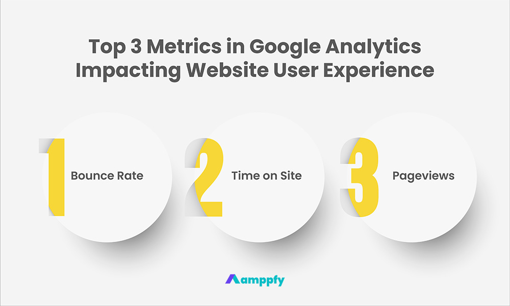
Top 3 Metrics in Google Analytics Impacting Website User Experience

-
Save
- Bounce rate: When a visitor lands on a webpage, then leaves without taking action, directly attributes to a website’s ranking in organic search.
- Time on site: The longer visitors stay on a website and consume more webpages, the higher opportunity to convert these prospects to customers.
- Pageviews: The more webpages a visitor views in one browsing session, the better engagement score the website receives.
With these three critical metrics in mind, how do you enhance the user experience? The short answer is to improve visitor engagement and increase time spent on the website.
Consider the following scenarios and how they improve visitor engagement.
3 Questions to Consider that Improve Website Visitor Engagement and Time on Site
- When visitors come through from Google’s organic search, what is the first attention grabber they see on a website’s landing page?
- Is there an intriguing website hero image (the first main image on the landing page)?
- What about having a captivating title that makes visitors stay on the webpage longer and continue browsing?
Example of How to Improve Website Visitor Engagement and Time on Site
Adding internal hyperlinks and call-to-actions to guide visitors to related pages is a practical tip to boost visitor engagement. This is a quick method to increase pageviews and improve visitors’ browsing experience by recommending similar content.
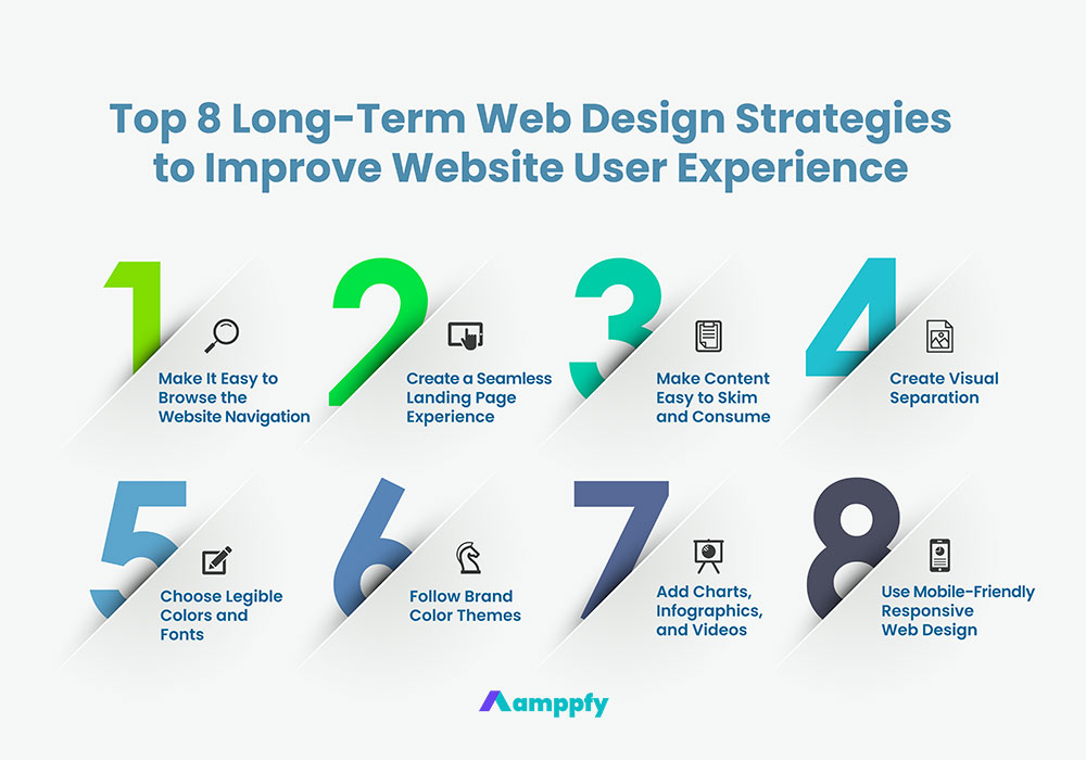
8 Long-Term Web Design Strategies to Improve Website User Experience
A practical long-term approach is critical to keeping user experience consistent throughout the website. Follow these effective web design strategies to create a seamless user experience and increase visitors’ content consumption during a browsing session.

-
Save
#1. Make It Easy to Browse the Website Navigation for Optimal Website User Experience
A website’s navigation is like the user manual that guides visitors through the website’s logic flow. Navigation influences the visitor journey. Place the most important categories on the navigation, followed by sub-categories or extensions of the main categories.
The navigation’s logic flow should resemble a funnel with the following two components.
How to Structure a Website Navigation
- Pace main ideas on top-level navigation.
- Then branch off into supporting ideas.
Remember, how visitors consume your content is driven by how you organize the content. The bottom line for building an effective navigation is to make it quick and easy for visitors to find the information they need.
#2. Create a Seamless Landing Page Reading Experience from Top to Bottom and Left to Right
F Shape Content Consumption on a Webpage
According to studies based on the heatmap of an effective landing page, people tend to spend more time looking at the top of a webpage, also known as top-of-the-fold. Furthermore, readers consume more content on the left side of a webpage than on the right. This content consumption pattern resembles an “F” shape.
Heatmap Visualization of Visitor’s Journey on a Webpage
A heatmap visualizes the data of visitors’ interactions on a landing page through a color-coded system. The system uses darker shades of red to indicate more user interaction or “eyeball time” versus the lighter shades of yellow, suggesting less user interaction.
So, consider organizing a webpage that captures the most attention – place the most important and eye-catching content towards the top of the page, flowing from left to right.
#3. Make Content Easy to Skim and Consume
Make it easy for visitors to browse through the website content. Some visitors speed-read while quickly glancing through a landing page’s main point. Others may selectively browse sections pertaining to their interest. In contrast, another group of readers may prefer organized, well-researched, and elaborate content.
Tailor Website Content Structure to Meet Different Browsing Habits
Visitors consume content in different ways. How do you satisfy diverse browsing habits and gain more control over a visitor’s content consumption? Start by structuring content into consumable and skimmable bite sizes. You can maximize visitor time on site and engagement by catering to different types of content readers.
Learn more about SEO content marketing and how to strategically optimize website content while maximizing organic traffic.
#4. Create Visual Separation
Apply different text formatting, and add white space as well as visuals to draw clear separation to different content sections. Add sub-headings for paragraphs below the primary H2 heading. These simple practices help readers find what they need and improve the overall readability score of your content.
Learn more about how to use H headings and implement technical SEO strategies.
Webpage Visual Separation Examples
- Create H2 and H3 headings.
- Use bullet points to create lists.
- Break long paragraphs into multiple easy-to-read sections.
- Insert images and infographics as paragraph separators.
- Add more white space.
#5. Choose Legible Colors and Fonts
Colors and fonts matter. Go with a simple, modern font that is legible against different background colors. When in doubt, black fonts on a white background or white fonts against dark-colored backgrounds are the standard, safe bets.
#6. Follow Brand Color Themes
Make color selections based on your brand’s color theme. Although there is no hard rule on a website’s best color palette, choosing a color theme for your brand guideline is always a good idea.
Harmonious color tones and esthetically appealing graphics are keys to making a landing page more consumable and unique. Colors and graphic elements guide visitors’ eyes to follow a webpage’s flow. They are also great section dividers for content when strategically placed.
#7. Add Charts, Infographics, and Videos to Enhance Website User Experience
Think outside of the cookie-cutter content on a typical landing page. Weave in visual elements that best support the content to improve user experience, such as charts, Infographics, and Videos.
Visual Element Example 1:
Graphics like charts or infographics to promote data or numbers-related content can pique more reader interest.
Visual Element Example 2:
Videos are an excellent type of stimulating content for website visitors to consume compared to long text blocks. Adding short videos to enhance content variety can increase visitors’ time on site and potentially drive more online demand.
For example, let’s say you sell fashion accessories on an e-commerce website. A short video showcasing your best sellers can significantly improve user experience and increase the likelihood of making a sale.
#8. Make a Website Mobile-friendly with Responsive Web Design
Google recommends responsive web design. It is a design coded to automatically and intuitively adjust to look and function correctly on any device and screen size, such as a laptop monitor, tablet, or mobile phone.
Mobile-Friendliness is an Important Ranking Signal for SEO
A mobile-friendly website starts with making the web design responsive. Since 2015, Google has officially made mobile-friendliness a ranking signal for SEO. If your website looks like a shrunken-down version of your desktop website with illegible text and images, it will not appear in mobile search results.
Learn more about how to create a responsive website with the complete mobile SEO guide.
Continue the Learning Journey with Amppfy
Amppfy’s digital marketing resource library is beginner-friendly, and zero technical or marketing experience is required to get started. Learn how to create a practical, actionable, and programmatic digital marketing playbook for any business website, e-commerce store, or content platform. Leverage effective SEO, SEM, and social media strategies to boost brand authority, increase online visibility, and generate quality demand.
Follow us on LinkedIn, Facebook, Instagram, and YouTube to stay updated on the latest marketing news, strategies, and free content.
Get Started with Free Generative AI Marketing Tools
- 100% Free
- No Account Required
- Available 24/7
Share via:


